
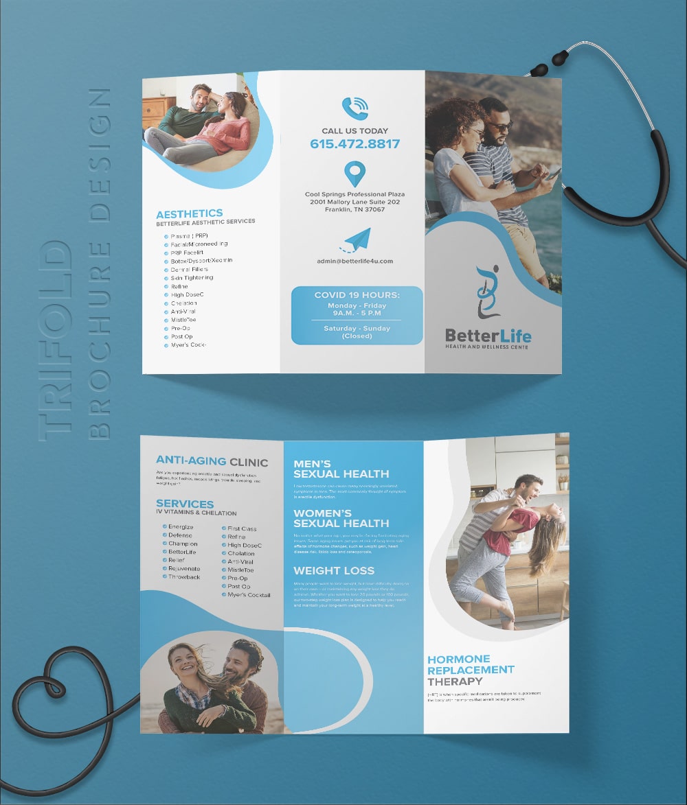
A customer might see your banner ad on a news site in the morning, get your invoice by email at noon, and pick up your brochure at an event that evening. If those three pieces look like they came from three different companies, you lose a little trust each time. That’s why stationery design, print materials, and digital ads should be planned as one system, not as separate jobs.
This guide looks at each one, what makes it work, and how to tie them together so your brand feels familiar wherever people meet it.
Why Consistency Matters More Than Ever
People don’t study your brand. They glance at it. Over time, those quick glances add up to recognition, but only if the colors, fonts, and tone stay the same.
Tiffany & Co. is the classic example. Its robin’s egg blue shows up on boxes, bags, catalogs, and ads, and the company even trademarked the shade. You can spot a Tiffany box across a room without reading a word. Small businesses won’t have that budget, but the lesson still applies. Repeat the same visual cues often enough, and people start to remember you.
Stationery Design: The Quiet Workhorse of Your Brand
Stationery rarely gets the spotlight, yet it goes everywhere. Letterheads carry your proposals. Envelopes deliver your contracts. Business cards end up in wallets and desk drawers. Notepads sit on clients’ tables during meetings.
Good stationery design turns these everyday items into small brand touchpoints. It also signals that you pay attention to detail. A law firm with a crisp, well spaced letterhead feels more established than one sending documents on a plain Word page with a stretched logo.
What a Complete Stationery Set Includes
Most businesses need a core set of pieces that share the same layout rules.
- Letterhead, both printed and as a digital template
- Business cards for every team member
- Envelopes in standard sizes
- Invoice, quote, and compliment slip templates
- Email signatures that match the printed pieces
The digital templates matter as much as the printed ones. Most letters and invoices now go out as PDFs, so your team needs editable files that keep fonts and spacing intact. Otherwise, the design falls apart the first time someone types into it.
Print Design Services: Still Worth the Ink
Some people assumed print would fade once everything moved online. It didn’t. Brochures, flyers, menus, posters, and catalogs still do things a screen can’t. You can hand them over, leave them behind, and hold them. A well made brochure sits on a desk for weeks. A banner ad disappears in seconds.
Print also feels more permanent, which builds credibility. That’s one reason luxury brands, real estate firms, and healthcare providers still invest heavily in printed material.
Getting the Technical Side Right
Print is far less forgiving than a screen. Once a run of 5,000 brochures is printed, there’s no quick edit. Professional print design services handle the technical details that keep files press-ready.
Files should be set up in CMYK, the color mode printers use, rather than the RGB mode screens use. Images need to be at least 300 DPI to avoid blurry results. In the US designers usually add a 0.125-inch bleed around the edges so no thin white lines appear after trimming. Important text should sit inside a safe zone, away from where the blade cuts.
Paper choice matters too. A heavy matte stock feels premium and calm. A glossy finish makes photos pop. Recycled paper suits brands that talk about sustainability, as long as the print quality still holds up.
Banner Ad Design: Making an Impression in Seconds
The first clickable banner ad ran in 1994 on HotWired, the early web version of Wired magazine. It was an AT&T ad that simply asked people if they’d ever clicked right there. Plenty of them did, mostly out of curiosity. Today, people have learned to ignore most banners, which means design has to work much harder.
Strong banner ad design grabs attention fast and makes one clear point. There’s no room for a paragraph, so every element has to earn its place.
What Makes a Banner Ad Work
A good banner usually has three parts: your logo, one short message, and a clear button. Clean layouts beat crowded ones almost every time. Bold contrast helps the ad stand out from the page around it, and readable fonts matter even more at small sizes.
Sizes matter as well. The Interactive Advertising Bureau sets common standards, and a few formats show up again and again. The 300 x 250 medium rectangle, the 728 x 90 leaderboard, the 160 x 600 wide skyscraper, and the 320 x 50 mobile banner cover most placements. Designing one strong layout that adapts across all of them saves time and keeps the campaign consistent.
Animation can help, but keep it short and subtle. Many ad networks limit how long an animation can run, and constant motion tends to annoy people rather than persuade them.
Tying Paper and Screen Together
The real value comes when all three areas follow the same rules. That starts with a simple brand style guide.
Pick your core colors and note their values for both print and screen, including CMYK, RGB, and HEX codes. Choose one or two fonts and stick with them. Set rules for how your logo appears, how much space surrounds it, and what to avoid. Then apply those rules to every letterhead, flyer, and ad.
Watch your colors closely. A bright blue on screen can look dull once printed, because CMYK can’t reproduce every RGB shade. Testing printed proofs against your digital ads helps you catch these gaps early. Many brands use Pantone references to keep key colors as close as possible across materials.
Tone of voice should match too. If your banner ads sound playful while your brochures read like legal documents, people will notice the mismatch even if the colors line up perfectly.
Common Mistakes to Avoid
Even well-designed pieces can slip. These are the issues that come up most often.
- Using low-resolution logos pulled from a website for print jobs
- Letting each team member create their own version of templates
- Cramming too much text into banner ads and brochures
- Skipping printed proofs and trusting the screen preview
- Updating the logo online but leaving old stationery in circulation
Most of these come down to having no single source of truth. A shared folder with approved logos, templates, and color codes fixes a surprising number of problems.
Final Thoughts
Your letterhead, your brochure, and your banner ad all tell the same story about your business, or at least they should. Stationery builds quiet credibility in daily communication. Print gives people something lasting to hold. Banner ads put your brand in front of new eyes in a split second.
When these pieces share the same colors, fonts, and voice, each one makes the others stronger. Plan them together, get the technical details right, and your brand will feel familiar whether it lands on a desk or a screen.